さて、今までplotlyを使ったインタラクティブな線グラフや散布図を作成する基本的な方法を見てきました。


今回は、もう少し細かい設定について見ていきたいと思います。
無理やり使っている部分もあるのであまりキレイではありませんが、最終的には以下のような図になります。
線グラフを中心に作成していますが、この設定は散布図を作成する際にもまったく同じように利用することが可能です。
全般設定
ここではよく使う設定について記載します。
これらの設定だけではあまりメリットを感じないかもしれませんが、それ以外の設定と組み合わせることで、少しずつ良くなっていきます。
こちらの記事で使ったデータフレームdfを使っています。
以下のようなコードになっています。各項目の説明については後述します。
import datetime
START_DATE = datetime.date(2020, 6, 8)
END_DATE = datetime.date(2020, 6, 12)
df_sub = df.query('Date>=@START_DATE & Date<=@END_DATE')
fig = go.Figure()
fig.add_trace(go.Scatter(x=df_sub['Date'],
y=df_sub['スノーピーク'],
mode='markers',
opacity=0.5,
showlegend=False,
visible=True,
name='スノーピーク'))
fig.add_trace(go.Scatter(x=df_sub['Date'],
y=df_sub['楽天'],
mode='lines',
showlegend=False,
visible=True,
name='楽天'))
visible
Falseにすると線を表示しなくなります。
デフォルトはTrueです。
showlegend
Falseにすると凡例に表示されなくなります。
デフォルトはTrueです。
opacity
マーカー、線の透明度を変えます。
1から0に近づくに従い、透明になっていきます。
mode
マーカー、線、テキストのどれを表示するかを指定します。
選択肢は以下になります。
- markers
マーカーを表示します。 - lines
線を表示します。 - text
テキストを表示します。
これらを組み合わせたい場合は'markers+lines'、'markers+text'、'markers+lines+text'という形で'+'でくっつけます。
's'を忘れないようにしましょう。
テキスト情報を設定する
例えば、以下のような具合でテキストを表示させることが可能です。
fig = go.Figure()
fig.add_trace(go.Scatter(x=df_sub['Date'],
              y=df_sub['スノーピーク'],
              mode='markers+lines+text',
              textposition='top center',
              texttemplate='%{y:.2f}円',
              textfont=dict(size=15),
              line=dict(color='#87cefa'),
              name='スノーピーク'))

fig.add_trace(go.Scatter(x=df_sub['Date'],
              y=df_sub['楽天'],
              mode='markers+lines+text',
              textposition='top center',
              texttemplate='%{y:.2f}円',
              line=dict(color='#90ee90'),
              name='楽天'))
では、一つ一つ見ていきましょう。
texttemplate
x軸の値、y軸の値を表示する際に、表示方法を変えることが可能です。
上記では、以下のようにして、y軸の値を小数点2桁まで表示しています。
texttemplate='%{y:.2f}円'
%{}で変数を囲むことで、その変数を表示します。x軸の値であればxを入れます。
“:2f”はPythonの表示方法を指定するやり方ですね。
textposition
テキストの表示位置を指定します。
上記の場合は"top center"をしていますので、点の上に中央揃えで表示しています。
指定できる種類は以下の通りです。縦にtop、middle、bottomがあり、横にleft、middle、rightがあり、その組み合わせで表現します。
- top left
- top center
- top right
- middle left
- middle center
- middle right
- bottom left
- bottom center
- bottom right
textfont
テキストのフォントを設定します。
テキストのサイズや色を辞書型変数で指定します。
- size
文字の大きさを指定します。 - color
文字の色を指定します。
text
任意のテキストを表示したい場合に指定します。
この場合は、リストの形で渡すことで可能です(上記のグラフでは使用していませんが、のちほど使います)。
マーカーのプロパティを設定する
fig = go.Figure()
fig.add_trace(go.Scatter(x=df_sub['Date'],
              y=df_sub['スノーピーク'],
              mode='markers+lines+text',
              marker=dict(color='#00ffff',
                          size=13,
                          line=dict(width=1,
                                    color='#000000'),
                          opacity=0.8
              ),
              textposition='top center',
              texttemplate='%{y:.2f}円',
              textfont=dict(size=15),
              line=dict(color='#87cefa'),
              name='スノーピーク'))

fig.add_trace(go.Scatter(x=df_sub['Date'],
              y=df_sub['楽天'],
              mode='markers+lines+text',
              marker=dict(color='#00ff7f',
                          size=13,
                          symbol='star',
                          line=dict(width=1,
                                    color='#000000',
                                    ),
                          opacity=0.8
              ),
              textposition='top center',
              texttemplate='%{y:.2f}円',
              line=dict(color='#90ee90',
                        dash='dot'),
              name='楽天'))
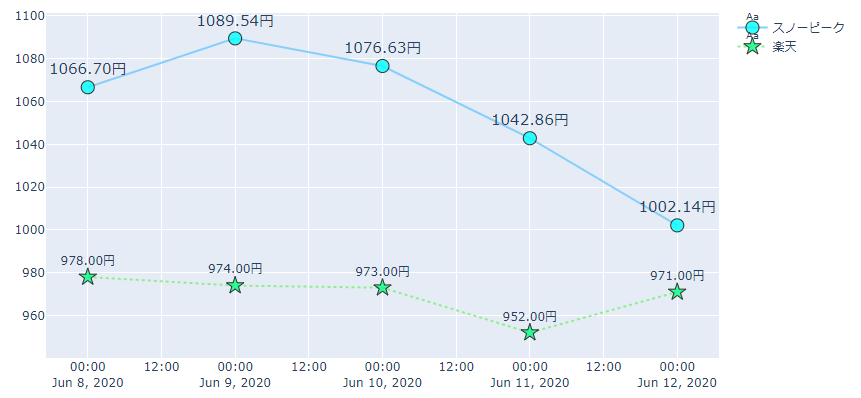
marker_size、marker_symbolなどの指定方法もありますが、markerを辞書型で指定することも可能です。
ここでは後者のmarker=dict(...)という形で指定する方法について説明します。
サイズだけを指定する場合などは、marker_size=12とかにする方が楽かと思います。
symbol
マーカーの形を指定します。
私がよく使うのは、
- デフォルトのcircle
- triangle-up、triangle-down
- square
- star
- diamond
- x
- triangle-up-open
などです。
以下にすべてのsymbolを記載しておきます。
"100" | "circle-open" | "200" | "200" | "circle-dot" | "300" | "300" | "circle-open-dot" | "1" | "1" | "square" | "101" | "101" | "square-open" | "201" | "201" | "square-dot" | "301" | "301" | "square-open-dot" | "2" | "2" | "diamond" | "102" | "102" | "diamond-open" | "202" | "202" | "diamond-dot" | "302" | "302" | "diamond-open-dot" | "3" | "3" | "cross" | "103" | "103" | "cross-open" | "203" | "203" | "cross-dot" | "303" | "303" | "cross-open-dot" | "4" | "4" | "x" | "104" | "104" | "x-open" | "204" | "204" | "x-dot" | "304" | "304" | "x-open-dot" | "5" | "5" | "triangle-up" | "105" | "105" | "triangle-up-open" | "205" | "205" | "triangle-up-dot" | "305" | "305" | "triangle-up-open-dot" | "6" | "6" | "triangle-down" | "106" | "106" | "triangle-down-open" | "206" | "206" | "triangle-down-dot" | "306" | "306" | "triangle-down-open-dot" | "7" | "7" | "triangle-left" | "107" | "107" | "triangle-left-open" | "207" | "207" | "triangle-left-dot" | "307" | "307" | "triangle-left-open-dot" | "8" | "8" | "triangle-right" | "108" | "108" | "triangle-right-open" | "208" | "208" | "triangle-right-dot" | "308" | "308" | "triangle-right-open-dot" | "9" | "9" | "triangle-ne" | "109" | "109" | "triangle-ne-open" | "209" | "209" | "triangle-ne-dot" | "309" | "309" | "triangle-ne-open-dot" | "10" | "10" | "triangle-se" | "110" | "110" | "triangle-se-open" | "210" | "210" | "triangle-se-dot" | "310" | "310" | "triangle-se-open-dot" | "11" | "11" | "triangle-sw" | "111" | "111" | "triangle-sw-open" | "211" | "211" | "triangle-sw-dot" | "311" | "311" | "triangle-sw-open-dot" | "12" | "12" | "triangle-nw" | "112" | "112" | "triangle-nw-open" | "212" | "212" | "triangle-nw-dot" | "312" | "312" | "triangle-nw-open-dot" | "13" | "13" | "pentagon" | "113" | "113" | "pentagon-open" | "213" | "213" | "pentagon-dot" | "313" | "313" | "pentagon-open-dot" | "14" | "14" | "hexagon" | "114" | "114" | "hexagon-open" | "214" | "214" | "hexagon-dot" | "314" | "314" | "hexagon-open-dot" | "15" | "15" | "hexagon2" | "115" | "115" | "hexagon2-open" | "215" | "215" | "hexagon2-dot" | "315" | "315" | "hexagon2-open-dot" | "16" | "16" | "octagon" | "116" | "116" | "octagon-open" | "216" | "216" | "octagon-dot" | "316" | "316" | "octagon-open-dot" | "17" | "17" | "star" | "117" | "117" | "star-open" | "217" | "217" | "star-dot" | "317" | "317" | "star-open-dot" | "18" | "18" | "hexagram" | "118" | "118" | "hexagram-open" | "218" | "218" | "hexagram-dot" | "318" | "318" | "hexagram-open-dot" | "19" | "19" | "star-triangle-up" | "119" | "119" | "star-triangle-up-open" | "219" | "219" | "star-triangle-up-dot" | "319" | "319" | "star-triangle-up-open-dot" | "20" | "20" | "star-triangle-down" | "120" | "120" | "star-triangle-down-open" | "220" | "220" | "star-triangle-down-dot" | "320" | "320" | "star-triangle-down-open-dot" | "21" | "21" | "star-square" | "121" | "121" | "star-square-open" | "221" | "221" | "star-square-dot" | "321" | "321" | "star-square-open-dot" | "22" | "22" | "star-diamond" | "122" | "122" | "star-diamond-open" | "222" | "222" | "star-diamond-dot" | "322" | "322" | "star-diamond-open-dot" | "23" | "23" | "diamond-tall" | "123" | "123" | "diamond-tall-open" | "223" | "223" | "diamond-tall-dot" | "323" | "323" | "diamond-tall-open-dot" | "24" | "24" | "diamond-wide" | "124" | "124" | "diamond-wide-open" | "224" | "224" | "diamond-wide-dot" | "324" | "324" | "diamond-wide-open-dot" | "25" | "25" | "hourglass" | "125" | "125" | "hourglass-open" | "26" | "26" | "bowtie" | "126" | "126" | "bowtie-open" | "27" | "27" | "circle-cross" | "127" | "127" | "circle-cross-open" | "28" | "28" | "circle-x" | "128" | "128" | "circle-x-open" | "29" | "29" | "square-cross" | "129" | "129" | "square-cross-open" | "30" | "30" | "square-x" | "130" | "130" | "square-x-open" | "31" | "31" | "diamond-cross" | "131" | "131" | "diamond-cross-open" | "32" | "32" | "diamond-x" | "132" | "132" | "diamond-x-open" | "33" | "33" | "cross-thin" | "133" | "133" | "cross-thin-open" | "34" | "34" | "x-thin" | "134" | "134" | "x-thin-open" | "35" | "35" | "asterisk" | "135" | "135" | "asterisk-open" | "36" | "36" | "hash" | "136" | "136" | "hash-open" | "236" | "236" | "hash-dot" | "336" | "336" | "hash-open-dot" | "37" | "37" | "y-up" | "137" | "137" | "y-up-open" | "38" | "38" | "y-down" | "138" | "138" | "y-down-open" | "39" | "39" | "y-left" | "139" | "139" | "y-left-open" | "40" | "40" | "y-right" | "140" | "140" | "y-right-open" | "41" | "41" | "line-ew" | "141" | "141" | "line-ew-open" | "42" | "42" | "line-ns" | "142" | "142" | "line-ns-open" | "43" | "43" | "line-ne" | "143" | "143" | "line-ne-open" | "44" | "44" | "line-nw" | "144" | "144" | "line-nw-open" | "45" | "45" | "arrow-up" | "145" | "145" | "arrow-up-open" | "46" | "46" | "arrow-down" | "146" | "146" | "arrow-down-open" | "47" | "47" | "arrow-left" | "147" | "147" | "arrow-left-open" | "48" | "48" | "arrow-right" | "148" | "148" | "arrow-right-open" | "49" | "49" | "arrow-bar-up" | "149" | "149" | "arrow-bar-up-open" | "50" | "50" | "arrow-bar-down" | "150" | "150" | "arrow-bar-down-open" | "51" | "51" | "arrow-bar-left" | "151" | "151" | "arrow-bar-left-open" | "52" | "52" | "arrow-bar-right" | "152" | "152" | "arrow-bar-right-open"
size
マーカーのサイズで、整数で指定します。
opacity
マーカーの透明度を0から1の範囲で指定します。
line
マーカーを囲む線です。
さらに辞書型の変数で指定します。
- width
線の太さ - color
線の色
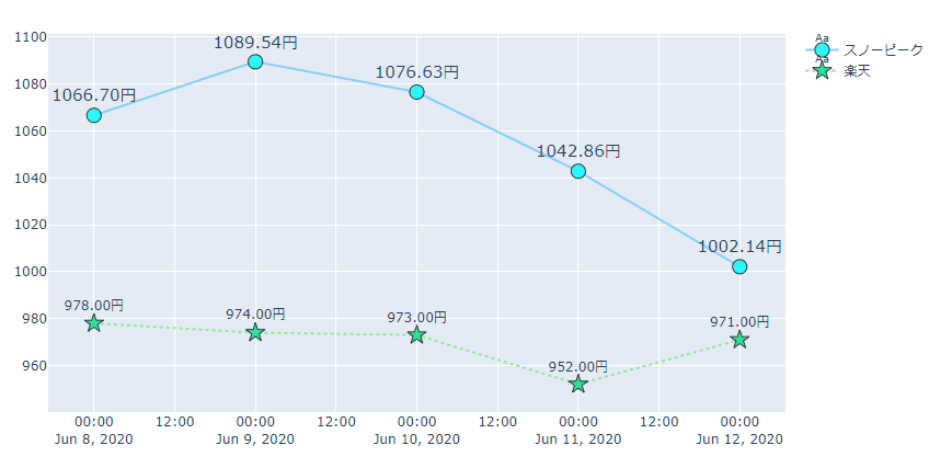
カーソルを合わせた際のラベルを設定する
カーソルを合わせたときに表示するラベルを指定する機能です。
以下のように設定することで、ラベルを指定することが可能です。
fig = go.Figure()
text = ['ABC' for _ in range(len(df_sub))]
fig = go.Figure()
fig.add_trace(go.Scatter(x=df_sub['Date'],
              y=df_sub['スノーピーク'],
              mode='markers+lines+text',
              marker=dict(color='#00ffff',
                          size=13,
                          line=dict(width=1,
                                    color='#000000'),
                          opacity=0.8
              ),
              textposition='top center',
              texttemplate='%{y:.2f}円',
              textfont=dict(size=15),
              text=text,
              hoverlabel=dict(bgcolor='#0000ff',
                              bordercolor='#4682b4',
                              font=dict(color='#FFFFFF'),
                              ),
              line=dict(color='#87cefa'),
              name='スノーピーク'))

fig.add_trace(go.Scatter(x=df_sub['Date'],
              y=df_sub['楽天'],
              mode='markers+lines+text',
              marker=dict(color='#00ff7f',
                          size=13,
                          symbol='star',
                          line=dict(width=1,
                                    color='#000000',
                                    ),
                          opacity=0.8
              ),
              textposition='top center',
              texttemplate='%{y:.2f}円',
              line=dict(color='#90ee90',
                        dash='dot'),
              name='楽天'))
次のようなラベルになります。
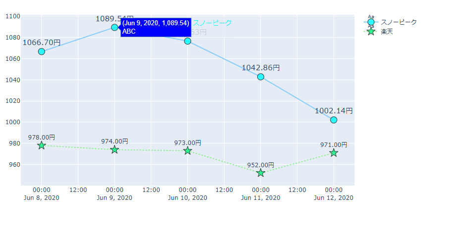
hoverlabel
- bgcolor
表示するラベルの背景色を指定します。 - bordercolor
表示するラベルの線の色を指定します。 - font
表示するラベルのフォントを指定します。
sizeやcolorを辞書型変数で指定します。 - align
複数行にまたがるときに、どちらに寄せるかを指定します。
left、right、autoがあり、デフォルトはautoです。
hoveron
マーカーにカーソルを当てたときにラベルを表示するのか、塗りつぶされた領域にカーソルを当てたときにラベルの表示をするのかを指定します。
pointsを指定するとマーカー、fillsを指定すると領域に対してラベルが表示されます。
両方の場合は"points+fills"という形で”+”でつなげて指定します。
領域を塗りつぶす
x軸との時系列データの間を塗りつぶしたり、割合の推移がわかるように表示することが可能です。
matplotlibでいうfill_betweenと同じような機能です。
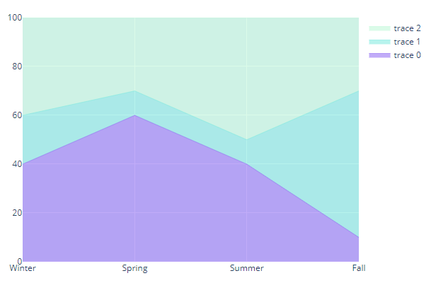
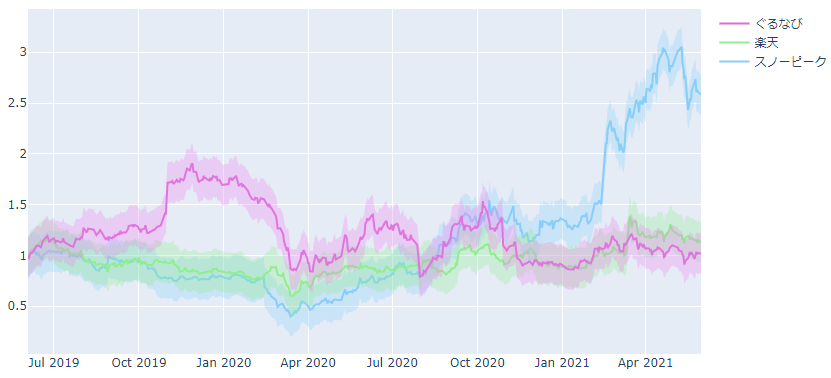
以下は、こちらの投稿で作成した例になります。
company_names = ['スノーピーク', '楽天', 'ぐるなび']
line_colors = ['#87cefa', '#90ee90', '#da70d6']
fill_line_colors = ['rgba(135, 206, 250, 0)',
                    'rgba(144, 238, 144, 0)',
                    'rgba(238, 130, 238, 0)']
fill_colors = ['rgba(135, 206, 250, 0.3)',
               'rgba(144, 238, 144, 0.3)',
               'rgba(238, 130, 238, 0.3)']

fig = go.Figure()
for company_name, line_color, fill_color, fill_line_color in \
      zip(company_names, line_colors, fill_colors, fill_line_colors):
  fig.add_trace(go.Scatter(x=df['Date'],
                y=df[company_name],
                line=dict(color=line_color),
                name=company_name))

  # 上限
  fig.add_trace(go.Scatter(x=df['Date'],
                y=df[company_name] + 0.2,
                line=dict(color=fill_line_color),
                fill=None,
                fillcolor=fill_color,
                showlegend=False,
                name=company_name))
  # 下限
  fig.add_trace(go.Scatter(x=df['Date'],
              y=df[company_name] - 0.2,
              line=dict(color=fill_line_color),
              fill='tonexty',
              fillcolor=fill_color,
              showlegend=False,
              name=company_name))

fig.show()
fillcolor
塗りつぶしの色を指定します。
fill
どのように塗りつぶすかを指定します。
- tozeroy
y=0の値、つまりx軸と挟まれた領域を塗りつぶします。 - tonexty
その前の系列データとのy方向に挟まれた領域を塗りつぶします。 - tozerox
x=0の値、つまりy軸と挟まれた領域を塗りつぶします。 - tonextx
その前の系列データとのx方向に挟まれた領域を塗りつぶします。 - toself
1つの系列で囲まれた領域を塗りつぶします。
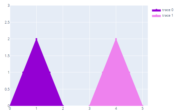
最後のtoselfの例だけplotlyの公式HPで紹介されている方法を記載しておきます。
自分自身の系列で囲まれた領域を塗りつぶす方法です。
fig = go.Figure()
fig.add_trace(go.Scatter(x=[0,0.5,1,1.5,2], y=[0,1,2,1,0],
                    fill='toself', fillcolor='darkviolet',
                    hoveron = 'points+fills', # select where hover is active
                    line_color='darkviolet',
                    text="Points + Fills",
                    hoverinfo = 'text+x+y'))

fig.add_trace(go.Scatter(x=[3,3.5,4,4.5,5], y=[0,1,2,1,0],
                    fill='toself', fillcolor = 'violet',
                    hoveron='points',
                    line_color='violet',
                    text="Points only",
                    hoverinfo='text+x+y'))

fig.update_layout(
    title = "hover on <i>points</i> or <i>fill</i>",
    xaxis_range = [0,5.2],
    yaxis_range = [0,3]
)

fig.show()
まとめ
今回は、線グラフを作成する上で使用する設定を細かく見てきました。
散布図でも同様の指定方法が可能になっています。
では、次はヒストグラムの作成方法を解説します!